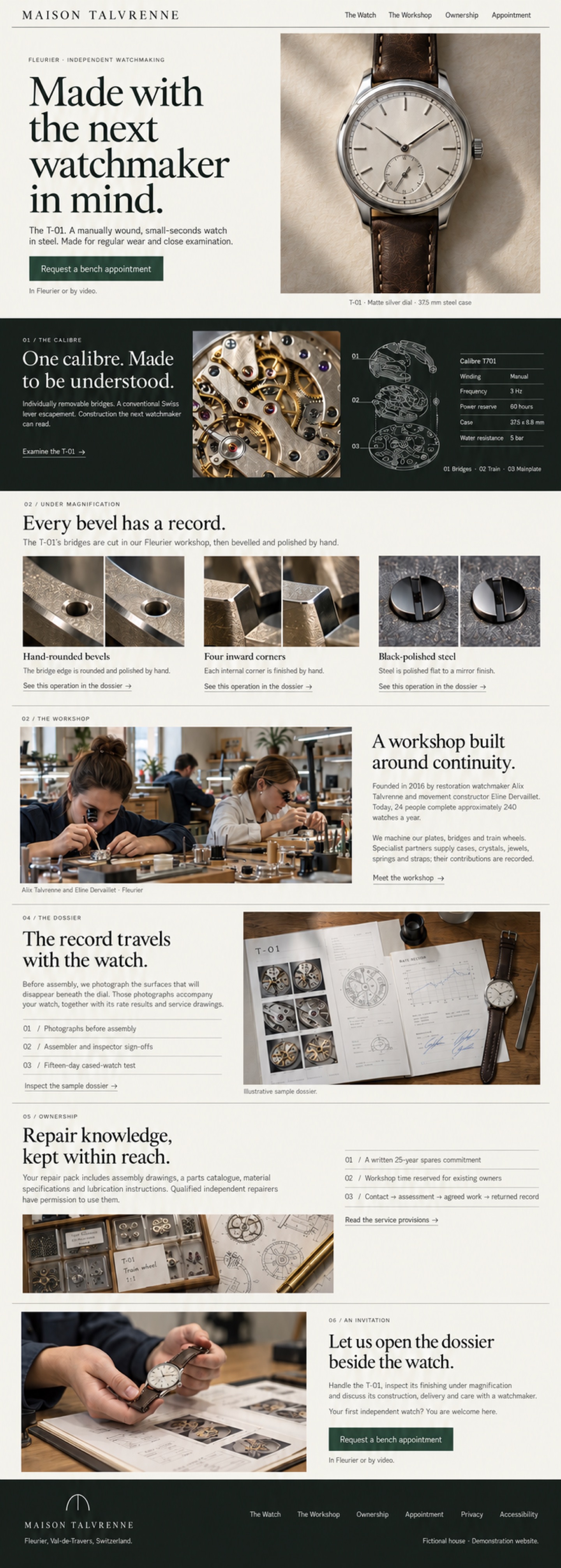
An inspection table translated into an editorial homepage: a complete watch in daylight, then the construction, the people and the records behind it. Paper, graphite and a single dark technical spread give the evidence room to speak.
Design reference: design.jpg, a 1440 px wide, full-page desktop image. Build the page from semantic HTML, CSS and minimal JavaScript; all interface copy below is real, selectable text. The PNG is an art-direction reference, not a website background or a source of sliced assets. The measurements and copy in this document govern implementation where the generated illustration approximates typography, spacing or fine technical details. Only the invented Maison Talvrenne identity appears.
Use the profile’s eight opaque sRGB tokens. No text opacity, translucent text surfaces or photographic backgrounds behind interface copy.
| Token | Hex | Role |
|---|---|---|
| Workshop paper | #F3F0E8 |
Page, header, light dialog and field backgrounds; primary text on dark |
| Graphite green | #232824 |
Main light-surface text, wordmark, focus rings on paper; primary-button hover fill |
| Slate | #535D56 |
Secondary light-surface text, captions, helper text, disabled text |
| Bench green | #314A3D |
Primary appointment fill; light-surface navigation accents and links |
| Movement dark | #171C19 |
Calibre band and footer background |
| Pale sage | #B9C2B9 |
Dark-surface captions, secondary copy, technical drawing strokes and links |
| Aged brass | #9D845B |
Tiny decorative monogram detail; never text, input boundaries or a sole state indicator |
| Mineral rule | #737A70 |
1 px rules and field boundaries on paper and movement dark |
Complete permitted text/background matrix. Ratios calculated from the hex values using sRGB relative luminance, (Llighter + 0.05) / (Ldarker + 0.05), rounded to two decimals. Every pair clears 4.5:1, including small text, hover, focus and disabled labels; large headings use the same passing pairs.
| Text | Background | Contrast | Applies to |
|---|---|---|---|
Graphite #232824 |
Paper #F3F0E8 |
13.17:1 | Headings, main copy, form labels and errors, light wordmark |
Slate #535D56 |
Paper #F3F0E8 |
6.01:1 | Captions, helpers, placeholders, disabled light controls |
Bench #314A3D |
Paper #F3F0E8 |
8.47:1 | Light links, active navigation and secondary actions |
Paper #F3F0E8 |
Bench #314A3D |
8.47:1 | Default primary-button label |
Paper #F3F0E8 |
Graphite #232824 |
13.17:1 | Hover/pressed primary-button label |
Paper #F3F0E8 |
Movement dark #171C19 |
15.16:1 | Dark headings, primary dark copy, footer wordmark |
Sage #B9C2B9 |
Movement dark #171C19 |
9.44:1 | Dark secondary copy, ledger labels, diagram numbers and footer links |
Functional non-text contrast: mineral/paper 3.89:1; mineral/movement dark 3.90:1. Bench button boundary/paper 8.47:1. The paper/graphite dual focus ring has 13.17:1 internal contrast; paper/movement dark has 15.16:1. Keep functional rules fully opaque. Brass is decorative only and conveys no information. Production text sits on flat token fills, even where the generated image suggests paper grain.
Google Fonts only: Newsreader 400 roman and 400 italic, and Public Sans 400 and 500. Use Newsreader for headings and the occasional short editorial phrase; Public Sans for all reading copy, navigation, labels and specifications. No synthetic bold or thin body weights. Load with display=swap; font fallbacks are Georgia, serif and Arial, sans-serif. Fonts are the only external requests.
The px values below are design equivalents at a 16 px root; implement in rem, retaining user browser font preferences. Interpolate between mobile and desktop with clamps. At 768–1023 px, cap H1 at 64 px and H2 at 40 px.
| Role | Family / weight | Desktop px | Mobile px | Line-height desktop / mobile | Letter spacing |
|---|---|---|---|---|---|
| H1 | Newsreader 400 | 88 | 44 | 1.00 / 1.05 | -0.02em |
| H2 | Newsreader 400 | 48 | 32 | 1.08 / 1.15 | -0.02em |
| H3 / finishing title | Newsreader 400 | 24 | 22 | 1.25 / 1.25 | 0 |
| Lead | Public Sans 400 | 20 | 18 | 1.60 / 1.60 | 0 |
| Body / ledger values / fields | Public Sans 400 | 16 | 16 | 1.60 / 1.60 | 0 |
| Navigation / buttons / links | Public Sans 500 | 14 | 14 | 1.50 / 1.50 | 0.01em |
| Eyebrow / section number | Public Sans 500 | 12 | 12 | 1.50 / 1.50 | 0.14em |
| Captions / helpers / ledger labels | Public Sans 400 | 14 | 14 | 1.60 / 1.60 | 0 |
| Field labels | Public Sans 500 | 14 | 14 | 1.50 / 1.50 | 0 |
Keep prose in sentence case; uppercase only eyebrows and the custom wordmark. Use tabular numerals in the specification ledger. The header wordmark is 304 × 27 px maximum on desktop and 208 × 19 px on mobile, with an accessible name “Maison Talvrenne — home.” Do not force desktop headline line breaks on mobile.
The header and footer frame seven homepage sections in the profile’s order. Header exact labels: The Watch · The Workshop · Ownership · Appointment. For the homepage showcase these navigate respectively to #watch, #workshop, #ownership, #appointment. Home wordmark targets #top. Navigation is a plain list of links, not an ARIA application menu.
Purpose: Show what the T-01 is, establish the repair-minded premise and offer the one primary action.
Layout: Paper background. Copy columns 1–5; complete-watch portrait columns 7–12, 4:5. Align the copy’s opening with the upper third of the watch. The whole case and both lugs remain visible. No lettering overlaps the photograph.
Exact copy:
Image: t01-matte-silver-portrait.webp. Soft daylight, steel case, matte silver dial, polished steel hands, full minute markings, recessed seconds at six, brown leather strap, on warm matte paper. Alt: “Complete T-01 in steel with a matte silver dial, small seconds at six and a brown leather strap.”
Mobile: Eyebrow, H1, lead, action and helper, then full-width portrait and caption in that DOM order. Button is full width; label may wrap. No shrinking the watch into a thumbnail.
Purpose: Make the stable movement platform and its construction inspectable.
Layout: Movement-dark band. Intro columns 1–4; reverse photo columns 5–8; exploded diagram columns 9–10; ledger columns 11–12. If ledger labels need more room, use a lower row across columns 9–12 rather than compressing text. Photograph 4:5, square-edged, directionally lit. Use a semantic dl for specifications. The SVG contains line art only; numbers and legend are HTML on the dark panel.
Exact copy:
#watch.Images: t01-calibre-reverse.webp, alt: “Reverse of calibre T/01 showing removable German-silver bridges, brass train wheels and polished steel fittings.” calibre-t01-exploded.svg, alt: “Exploded calibre view separating the removable bridges, wheel train and mainplate.” Repeat its complete meaning in the adjacent HTML legend; no essential information depends on image inspection.
Mobile: Intro → reverse photograph → diagram and legend → ledger → link. Diagram width 100%, no pan/zoom or horizontal overflow. Ledger rows use a flexible label/value grid and wrap units together.
Purpose: Name three operations and connect each to documentary evidence.
Layout: Paper; heading and introduction above three equal four-column figures. Each photograph is a before/after diptych with identical component position, lens and lighting. Beneath each pair add HTML labels “Before finishing” and “After finishing”; never bake labels into assets.
Exact copy:
#sample-dossier. Add a visually hidden operation name to each accessible link name.Images: finishing-rounded-bevel-diptych.webp, alt: “Matching bridge views before and after rounding and polishing the German-silver edge.” finishing-inward-corner-diptych.webp, alt: “The same inward bridge corner before and after hand finishing, with the polished internal angle visible.” finishing-black-polish-diptych.webp, alt: “Matching steel-fitting views before polishing and after flat mirror polishing under controlled directional light.”
Mobile: One complete figure at a time, in the same order. Keep each before/after pair together. No slider, carousel, hover-only enlargement or swipe dependency.
Purpose: Establish authorship, workshop scale and candid supplier disclosure.
Layout: Paper and a mineral top rule. Eyebrow above; 16:9 workshop photo columns 1–7, copy columns 9–12. Caption below the photo. Show Alix and Éline working, with workshop colleagues in the background.
Exact copy:
Image: workshop-alix-eline-team.webp. Alt: “Alix Talvrenne and Éline Dervaillet work at adjacent daylight benches, with colleagues and precision tools behind them.” These are fictional people; commission original depictions, not identifiable real watchmakers.
Mobile: Eyebrow → heading and body → photograph and caption → disclosure. Maintain this reading order in the DOM; CSS places the photo to the left on desktop.
Purpose: Show that the owner receives evidence about their individual watch.
Layout: Paper with a mineral top rule. Copy and three ruled rows columns 1–5; dossier still life columns 6–12, 8:5. Use an ordered list for the three records. A native details below the list reveals the sample evidence descriptions; its summary is the visible secondary action. The photograph contains incidental document marks only; all meaningful document information is repeated as HTML.
Exact copy:
sample-dossier: “Inspect the sample dossier”Do not invent a serial number, measured rate, inspection date or signatory. The still-life image gives the intended photography; it is not an authentic test report. Finishing links focus the disclosure summary and open its details as a small progressive enhancement; without JavaScript the target remains visible and can be opened natively.
Image: ownership-dossier.webp. Alt: “Illustrative open inspection dossier with movement photographs, sign-off sheets and a regulation chart beside the T-01.”
Mobile: Eyebrow, headline, body, photograph and caption, three rows, disclosure. All tables or evidence text wrap; no PDF download or external viewer is required.
Purpose: Explain how repair knowledge, spare parts and service provisions support continued ownership.
Layout: Paper, mineral rule. Copy columns 1–6, 3:1 parts-and-drawings strip below. Three provision rows columns 8–12, followed by a native disclosure. Use an ordered list for the four service stages described in the last provision.
Exact copy:
The 25-year statement concerns service-critical spare parts; it is not a warranty or a promise of free maintenance. No unsupported turnaround time is displayed.
Image: service-parts-and-drawings.webp. Alt: “Organised trays of spare movement parts beside a technical assembly drawing on the workshop bench.”
Mobile: Eyebrow, heading, body, image strip, provisions and disclosure. The last process row wraps into a vertical ordered sequence, keeping all four stages.
Purpose: Offer a welcoming, concrete next step in Fleurier or by video.
Layout: Paper; photo columns 1–7, copy columns 8–12; 8:5 photo of hands offering the watch beside its open dossier. Keep the offer calm and practical. No form is visible in the full-page image; the request form opens only on action.
Exact copy:
Image: bench-appointment.webp. Alt: “A watchmaker offers the steel T-01 above an open dossier, ready for inspection at the bench.”
Mobile: Eyebrow, headline, copy, welcoming line, full-width action, helper, then image. The action opens the same dialog as the hero action.
Purpose/layout: Movement-dark band; monogram and wordmark left, two compact link groups right. A lower row holds location and showcase disclosure. Footer is in normal flow.
Exact copy: “MAISON TALVRENNE”; “Fleurier, Val-de-Travers, Switzerland.”; links “The Watch”, “The Workshop”, “Ownership”, “Appointment”, “Privacy”, “Accessibility”; disclosure “Fictional house · Demonstration website.”
Main footer links use the header’s anchors. “Privacy” and “Accessibility” each open a native disclosure with the following text, so the homepage showcase has no missing policy destinations:
Assets/mobile: talvrenne-wordmark.svg, talvrenne-monogram.svg. Hide the ornamental monogram from assistive technology; the wordmark has the house name as its accessible label. On mobile stack identity, navigation, policies, location, disclosure with 32 px separation. Links remain 48 px tall, without horizontal scrolling.
Shared interaction rules. All standalone targets are at least 48 × 48 CSS px. Buttons may grow taller when labels wrap. Use native anchors, buttons, inputs, radios, details/summary and dialog. Every focusable element gets an immediate dual ring: on light surfaces, 2 px paper separation plus a 2 px graphite outer outline; on dark surfaces, 2 px movement-dark separation plus a 2 px paper outline. No ring animation or clipping. In forced-colors mode retain a system outline. Document title: “Maison Talvrenne — The T-01”; lang="en"; one H1 followed by H2 section headings and H3 subheads. The first focusable link is “Skip to main content”, targeting main#main; when focused it appears as bench text on an opaque paper panel above the header.
| Component | Default | Hover / pressed | Focus | Disabled / unavailable |
|---|---|---|---|---|
| Navigation | Graphite on paper; 48 px targets; selected section indicated by underline and aria-current="location" |
Bench text; underline extends over 400 ms | Shared light ring; active underline stays visible | A non-interactive span with slate text and visible “Unavailable”; omit from tab order. Normal homepage links are enabled |
| Primary appointment button | Paper on bench, 1 px bench boundary, 16 px vertical / 24 px horizontal padding | Paper on graphite, immediate color change; no movement | Shared light ring around the control | Native disabled, slate on paper, mineral boundary; label “Appointment unavailable”; no opacity reduction |
| Secondary and inline links | Bench on paper or sage on movement dark; visible 1 px underline | Same passing colors; underline thickness becomes 2 px | Shared surface ring, underline retained | Replace anchor with plain slate/paper or sage/dark text and “Unavailable”; no empty href or fake disabled anchor |
| Disclosure summary | Same as secondary links; native disclosure triangle retained; 48 px minimum target | Underline thickens; open state is explicit from native marker | Shared surface ring | If content unavailable, render plain text with “Unavailable”; no empty disclosure |
| Form fields / radio choices | Graphite text on paper, persistent graphite labels, slate hints, 1 px mineral borders; 48 px minimum height | Bench border; checked radio uses bench with paper inner mark | Shared light ring; never rely on border change alone | Native disabled, slate on paper, mineral border plus “Unavailable” hint; no opacity reduction |
| Footer / policy disclosures | Paper identity and sage links on movement dark | Sage retained; 2 px underline | Shared dark ring | Sage plain text plus “Unavailable”; no tab stop. Policies are enabled in this design |
| Dialog close button | Bench label “Close” on paper; 48 px target | Graphite label, visible underline | Shared light ring | Always enabled; it must remain possible to leave the dialog |
Mobile navigation: Replace the desktop link row below 768 px with a 48 px “Menu” button; expanded label “Close menu”, aria-expanded, and aria-controls. It expands links inline below the header rather than covering content. Escape closes and returns focus to the trigger. Choosing a link closes the panel and moves focus to the target heading. With JavaScript unavailable, show the link list by default. Use the same button text pairs and states as secondary links. Keep the header in normal flow; no sticky bar can cover focused content.
Editorial arrow: Use arrow-right.svg at 16 × 16 px beside secondary action labels, in the same passing text color as the link. It is decorative (aria-hidden="true"), never an independent target, and stays still on hover. Do not replace native disclosure markers with an ambiguous arrow.
Appointment dialog: Both primary buttons open the same native dialog, width min(640px, viewport - 48px), maximum block size calc(100dvh - 48px), internally scrollable. Opaque paper panel and movement-dark backdrop; text exists only inside the paper panel. Heading: “Request a bench appointment”. Intro: “In Fleurier or by video. Tell us what you would like to inspect.” A visible notice before fields reads “Demonstration form. No enquiry will be sent or stored.”
Fields, in order:
autocomplete="name").autocomplete="email").Required-field helper: “Name, email and appointment format are required.” Visible actions: “Preview request”, “Close”. Keep focus inside the modal while open; focus its heading on entry; Escape and Close dismiss and return focus to the originating appointment button. No automatic navigation, date picker, credentials, countdown or file upload.
Validation copy: “Enter your name.”, “Enter a valid email address.”, “Choose an appointment format.” Add a graphite error icon, 2 px graphite boundary, aria-invalid="true" and the message through aria-describedby; never use color alone. Focus the first invalid field after announcing “Please check the marked fields.” in a polite status region. On a valid preview, announce “Preview ready. This demonstration has not sent your request.” and display the user’s entered details as text; actions “Edit request” / “Close”. User content must be inserted as text, not HTML. No submit handler makes a network request, sends email, uses local storage or claims receipt. Closing clears the temporary form entries. Without JavaScript, hide request triggers and expose the same notice and fields inline in the appointment section with a disabled “Preview request” button and helper “Enable JavaScript to preview this demonstration form.”
Implementation checks: Images receive explicit intrinsic dimensions, max-width:100%, and the supplied alt text; preload only the hero image and lazy-load later photos. Use semantic landmarks and reading order as specified. Verify keyboard traversal, modal exit and focus return, reduced motion, 200% text resize, 320 px reflow, and WCAG text-spacing overrides without clipping or horizontal scrolling. These are build acceptance checks, not claims that a raster image proves accessibility.
cubic-bezier(0.22, 1, 0.36, 1); baseline underline remains visible so links are always identifiable.prefers-reduced-motion: reduce, use zero-duration animations and transitions, show final images immediately, and retain scroll-behavior:auto. Native scrolling remains unchanged in every mode. A later film would require user initiation, captions and visible controls; no film is specified here.Create the following under clients/watch/assets/ (relative to examples/maison-lumen/). The homepage will reference them as ../../clients/watch/assets/<file> from sites/watch/. No assets are manufactured by this design task; the image is a visual brief for the asset team.
SVG sizes are viewBox dimensions, with scalable paths and no embedded raster or fonts. Wordmark and monogram use currentColor, exported for the permitted light/dark pairings. Technical drawing and icons use currentColor too; labels stay HTML. Photo dimensions are delivery masters, not CSS display dimensions. Strip unnecessary metadata and export WebP in sRGB; aim for ≤250 KB hero, ≤180 KB each other photo, with lower-resolution derivatives made during implementation if needed.
| File name | Kind | Size in px | Format | What it shows |
|---|---|---|---|---|
talvrenne-wordmark.svg |
logo | 720 × 64 | SVG | Original spaced-capital “MAISON TALVRENNE” wordmark, no borrowed device or trademark |
talvrenne-monogram.svg |
monogram | 96 × 96 | SVG | Original removable-bridge-inspired arch and stem; restrained brass detail is optional and decorative |
arrow-right.svg |
icon | 24 × 24 | SVG | Single fine right arrow for labelled editorial links; decorative beside real text |
calibre-t01-exploded.svg |
icon | 480 × 640 | SVG | Fine-line exploded calibre drawing: bridges, train, mainplate; no baked-in numbers or labels |
t01-matte-silver-portrait.webp |
photo | 1600 × 2000 | WebP | Complete steel T-01, silver small-seconds dial and brown strap on paper, soft side daylight |
t01-calibre-reverse.webp |
photo | 1440 × 1800 | WebP | Close reverse-side study of removable German-silver bridges, brass wheels and steel fittings |
finishing-rounded-bevel-diptych.webp |
photo | 1600 × 1000 | WebP | Matched before/after views of one bridge edge; 800 × 1000 per half, no text |
finishing-inward-corner-diptych.webp |
photo | 1600 × 1000 | WebP | Matched before/after views of one inward bridge corner; same angle, light and scale |
finishing-black-polish-diptych.webp |
photo | 1600 × 1000 | WebP | Matched steel-fitting views before and after mirror polishing, controlled dark reflection |
workshop-alix-eline-team.webp |
photo | 2400 × 1350 | WebP | Fictional Alix and Éline working at adjacent benches, colleagues and tools in a daylight atelier |
ownership-dossier.webp |
photo | 2000 × 1250 | WebP | Open illustrative photo dossier, sign-offs and test chart with watch and loupe, no fabricated readable measurements |
service-parts-and-drawings.webp |
photo | 1920 × 640 | WebP | Parts trays and repair assembly drawing; wide crop with material detail retained |
bench-appointment.webp |
photo | 2000 × 1250 | WebP | Watchmaker’s hands offering the T-01 beside its open dossier at the bench |
Asset accuracy: maintain the same T-01 case, silver dial, small seconds and strap across shots. Never introduce another watch brand, real people’s identities or unsupported complications. The diagram must depict the approved fictional movement architecture, not copy a real manufacturer’s calibre. Photography may contain incidental documentary marks, but production instructions, captions, legends, before/after labels and test explanations must be HTML.
Created with the built-in image generation tool, followed by its refinement pass. The generator returned a 750 × 2097 px full-page composition; the final PNG was proportionally resampled to 1440 × 4026 px for the requested desktop-width deliverable. This normalization adds no photographic detail; commission separate source assets from the table for implementation.
Final refinement prompt (verbatim):
Use case: ui-mockup. This is the edit target: the complete Maison Talvrenne full-page desktop homepage. Preserve the exact entire design, all seven sections, photographs, wording, footer and composition. Produce an enlarged high-resolution final PNG EXACTLY 1440 pixels wide and 4032 pixels tall; this must be 1440px-wide desktop, not a 750px preview. Refine text crispness only as needed at that size. No cropping, no added elements, no missing bottom sections, no changes in palette or photography. Every pixel should represent the same complete design at the larger resolution.
The initial generation supplied the full seven-section copy, palette, type families and photographic subjects specified above. Its tall-layout request was approximate; the verified saved dimensions above are the actual deliverable.